.png&w=96&q=75)
Quave ONE has a new navigation. Here is where everything moved.
New top menus, compact Dashboard cards, left sidebars, and easier environment search.
Hey,
We changed the Quave ONE navigation. The goal is simple: make every page easier to find as the product grows.
But navigation changes can be annoying when you know exactly where something used to be, so here is the short version. Nothing was removed. We changed where things live.
Account and workspace pages moved to the top
Pages that belong to the whole account or workspace are no longer hidden as tabs inside another page.
Use the Account menu at the top for pages such as Dashboard, Account settings, Members, Credentials, Plans & billing, and Audit. Use Workspace for Agents, Automations, Notifications, Contact Points, Shared Storage, Nodes, and other resources you use across Apps.
You will only see the items available for your account, plan, and access level.
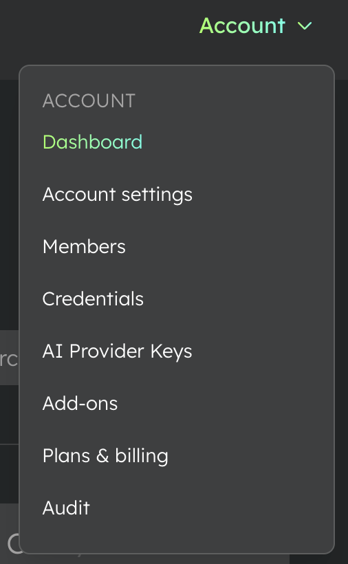
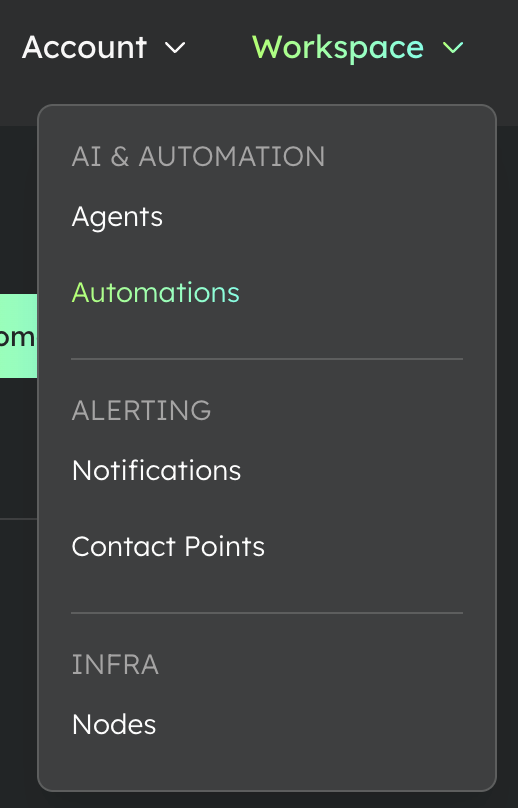
If you are looking for something that is not specific to one App or environment, start with Account or Workspace.
Apps and environments now have a left sidebar
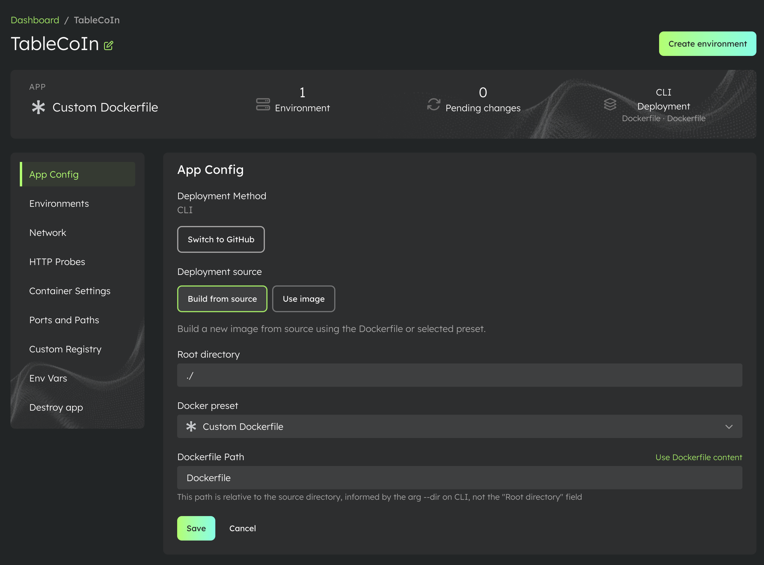
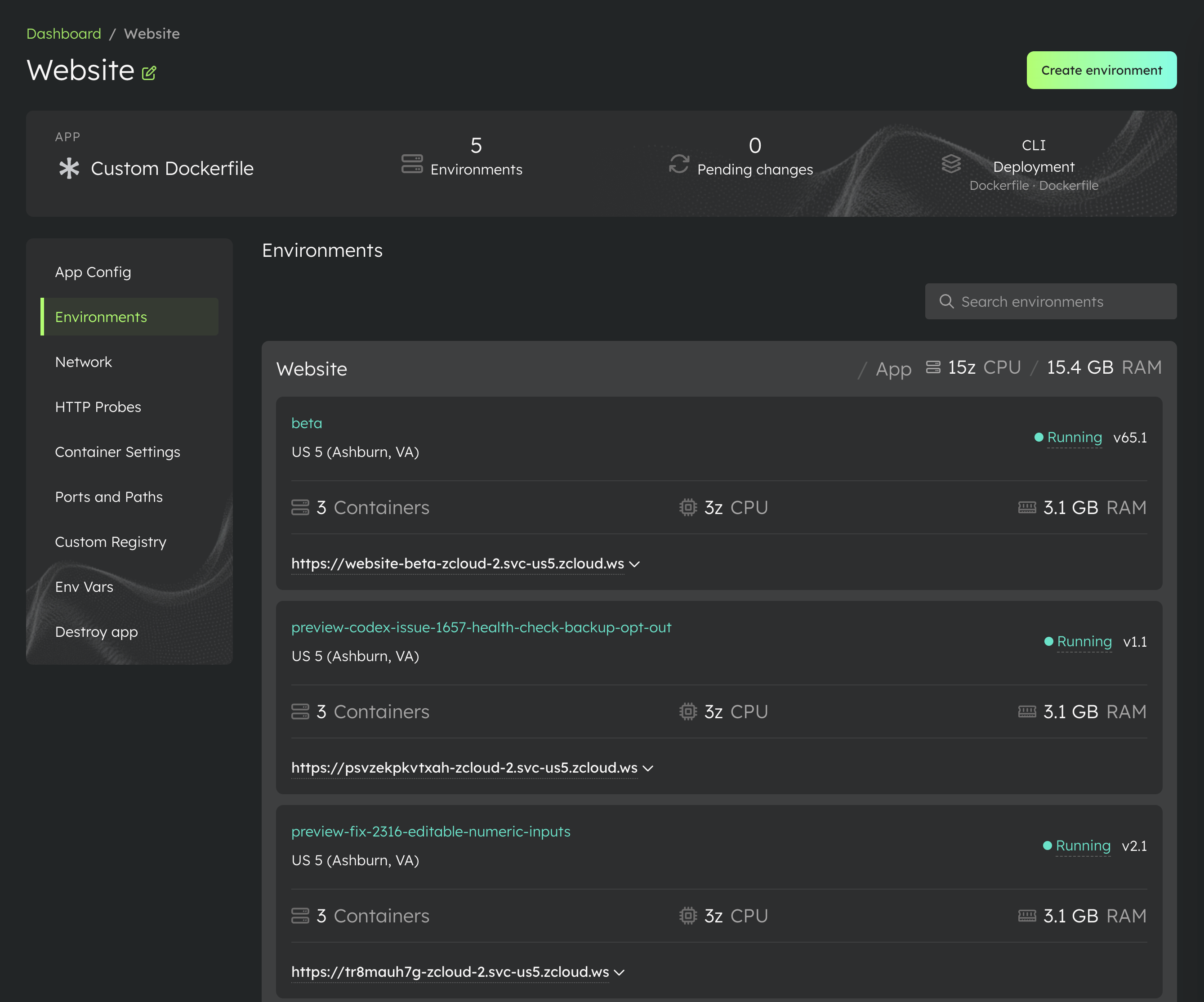
When you open an App, its pages are now in a sidebar on the left. That includes App Config, Environments, Network, HTTP Probes, Container Settings, and the other pages available for that App.
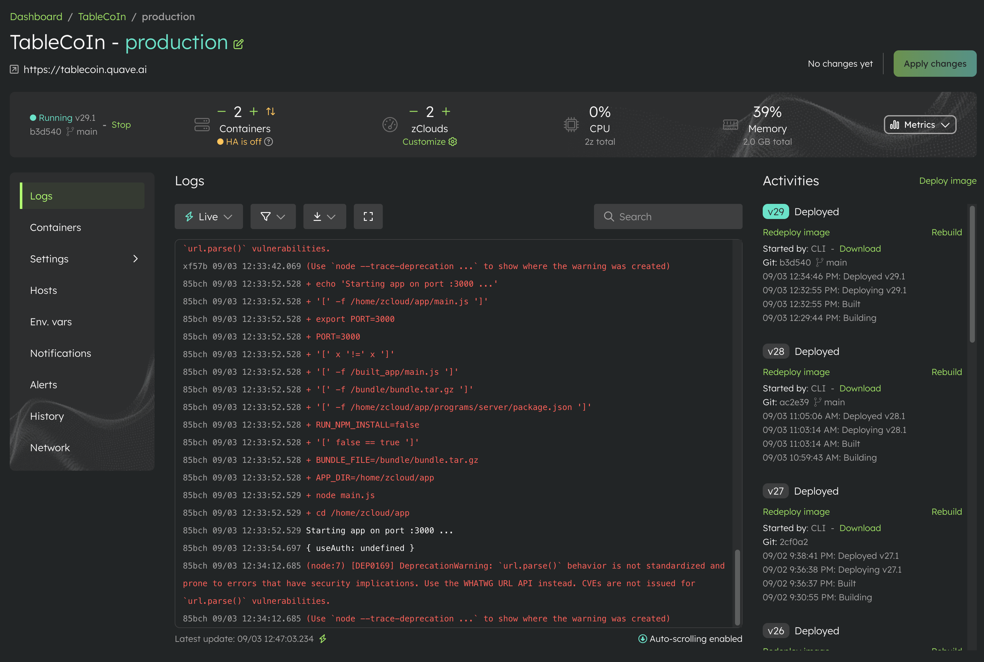
Open an environment and you will see the same pattern for Logs, Containers, Settings, Env. vars, Notifications, Alerts, History, Network, and the pages that apply to that environment.
The old row of tabs is gone. The sidebar stays in the same place, gives every page a clear label, and makes the structure easier to scan.
Settings is no longer one crowded page
Environment Settings had become too long. Finding one option meant scrolling through many unrelated sections, so Settings now has its own sidebar items, including Environment protection, Change region, Storage, Advanced settings, Security settings, and the other settings available for that environment type.
The controls did not disappear. They are now split into smaller pages, exactly where you would expect to find them.
More Apps fit on the Dashboard
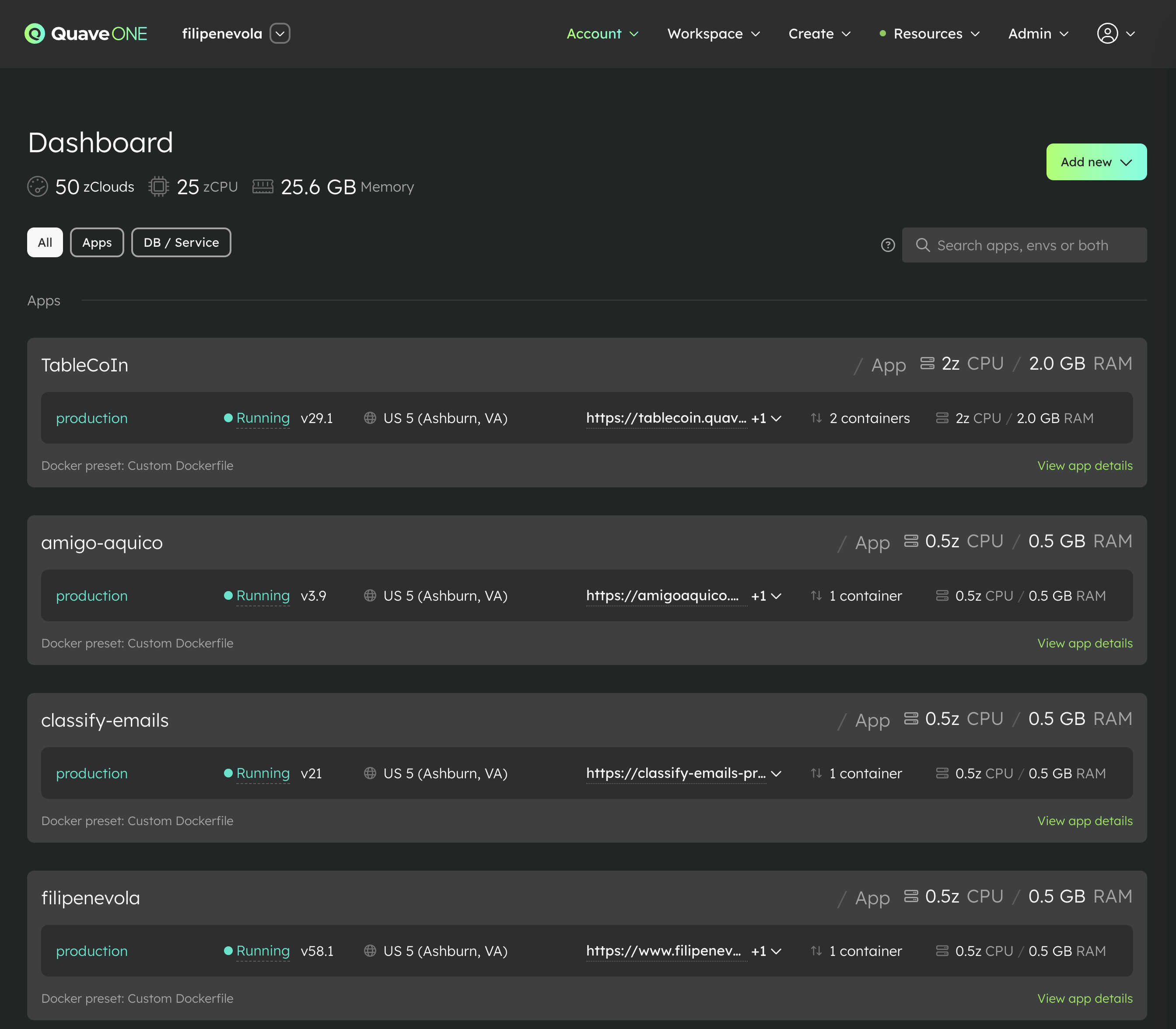
The App cards on the Dashboard are shorter now, so you can see more Apps without scrolling while still seeing the important environment, status, region, URL, container, CPU, and memory information.
We also added App type filters at the top. You can show everything, only Apps, or only databases and services, then use the search next to them when you need one specific App or environment.
Search environments inside an App
If an App has multiple environments, its Environments page now has a search field. You no longer need to scan a long list to find one preview, beta, staging, or production environment.
The docs are already updated
We also updated the Quave ONE docs to use the new navigation and the correct dashboard paths. If you follow a guide, its steps should match what you see in Quave ONE today.
Open Quave ONE and try the new navigation. If you still spend time looking for a page, reply to this email and tell me which one, because that means we still have work to do.
Have a great week and go enjoy the people you love.
Filipe